

LibraSync
A Library system that enhances efficient Study room Tracking and Resource discovery.
Overview
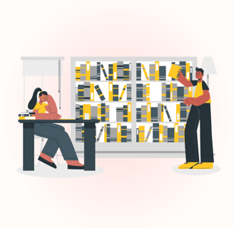
Finding a quiet, available study room shouldn't be a hassle. University students often waste time looking for available rooms, leading to frustration and inefficiency.
This case study explores how a user-centered mobile app simplifies room reservations and enhances the library experience by integrating real-time availability, a streamlined booking system, and digital resource access.
Quick Glimpse of the Design


Discovery
Ideation
Design
Retrospective


Discovery
What is the Challenge?
Through research, we identified three major issues students face when trying to book a study room:
1. Time wasted in Searching for Available Rooms
Students spend time on the website searching for available rooms and if they were booked then again 10-15 minutes walking around the library to find an open study space, especially during peak hours.
2. Inefficient & Inconvenient Booking Methods
Existing booking systems required multiple steps via a website, making it inconvenient for students in a rush. Also, they didn't reflect back when any room was cancelled.
3. Missed Opportunities & Overcrowding
Many rooms remained underutilized because students weren’t aware they were available. Others were overcrowded due to a lack of pre-booking options.
The Process of Identifying Pain Points
Objective: The motive of User Research was to understand how students currently book study rooms and the key challenges they face.
Conducted: Surveys. Interviews and Observations.
1. Surveys
Surveys give Quantitative data and Students were the primary users hence I started collecting data through surveys where I got around 4-5 users filled the survey form.
2. Interviews
Conducted Interviews with three University Students, with a mix of undergraduate and graduate students that helped me understand the real challenges they faced.
3. Contextual Inquiry
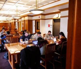
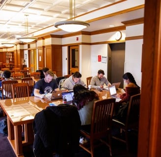
To get raw feedback I went to the University library, sat and observed students roaming around to check if a study room is available. If not, they would just sit outside in the common sitting area with disappointment. I went ahead and asked basic questions to such students with consent.
Competitor Analysis Findings:
I compared apps like LibCal, DePaul Library and Skeda to find out the existing problems and opportunities for our application.
Problems in Existing Apps:
1. Complex Booking Process: Requires multiple steps instead of a quick, seamless experience.
2. No Real-Time Updates: Students cannot see availability instantly, leading to overbooking or wasted searches.
3. Lack of Personalization: No smart suggestions based on user preferences or past bookings.
Problems in Existing Apps:
1. Speed & Simplicity: A 30-second booking process with minimal clicks.
2. Mobile-First Design: A modern, intuitive interface.
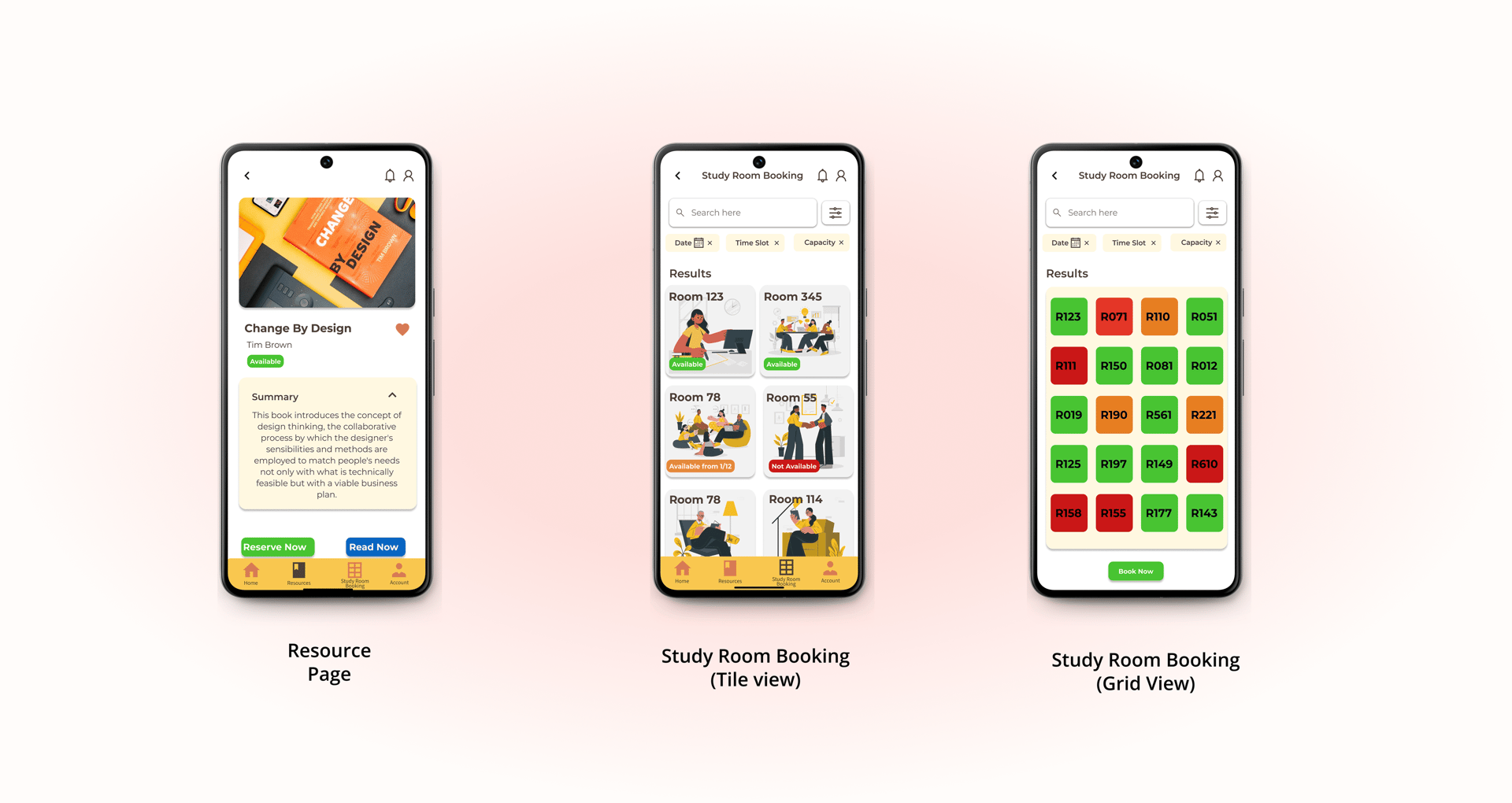
3. Real-Time Room Availability: Color-coded live updates.


Ideation
User Personas
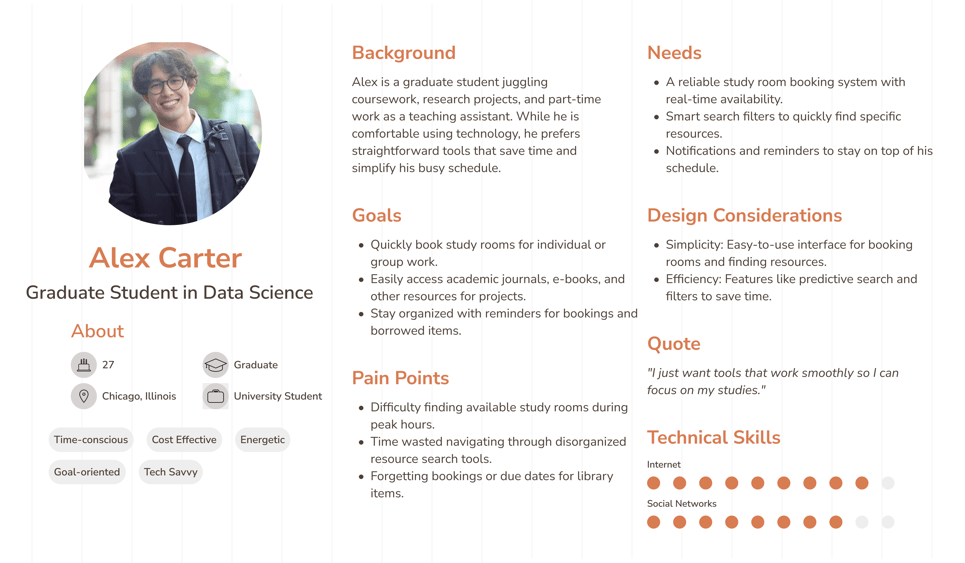
Based on the Findings, I developed a Primary User Persona.
Graduate Student (Alex): A Graduate University Student who represents the users who are juggling between jobs and studies and require a quiet time for studies & assignments.
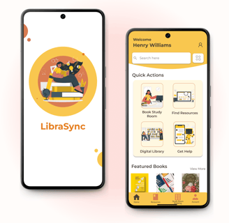
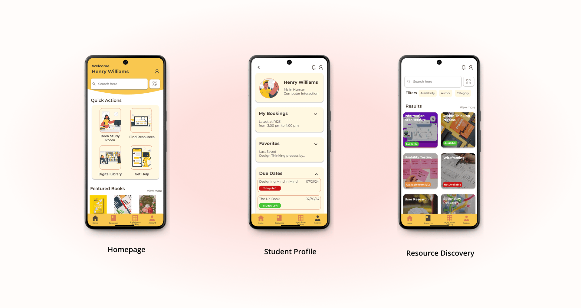
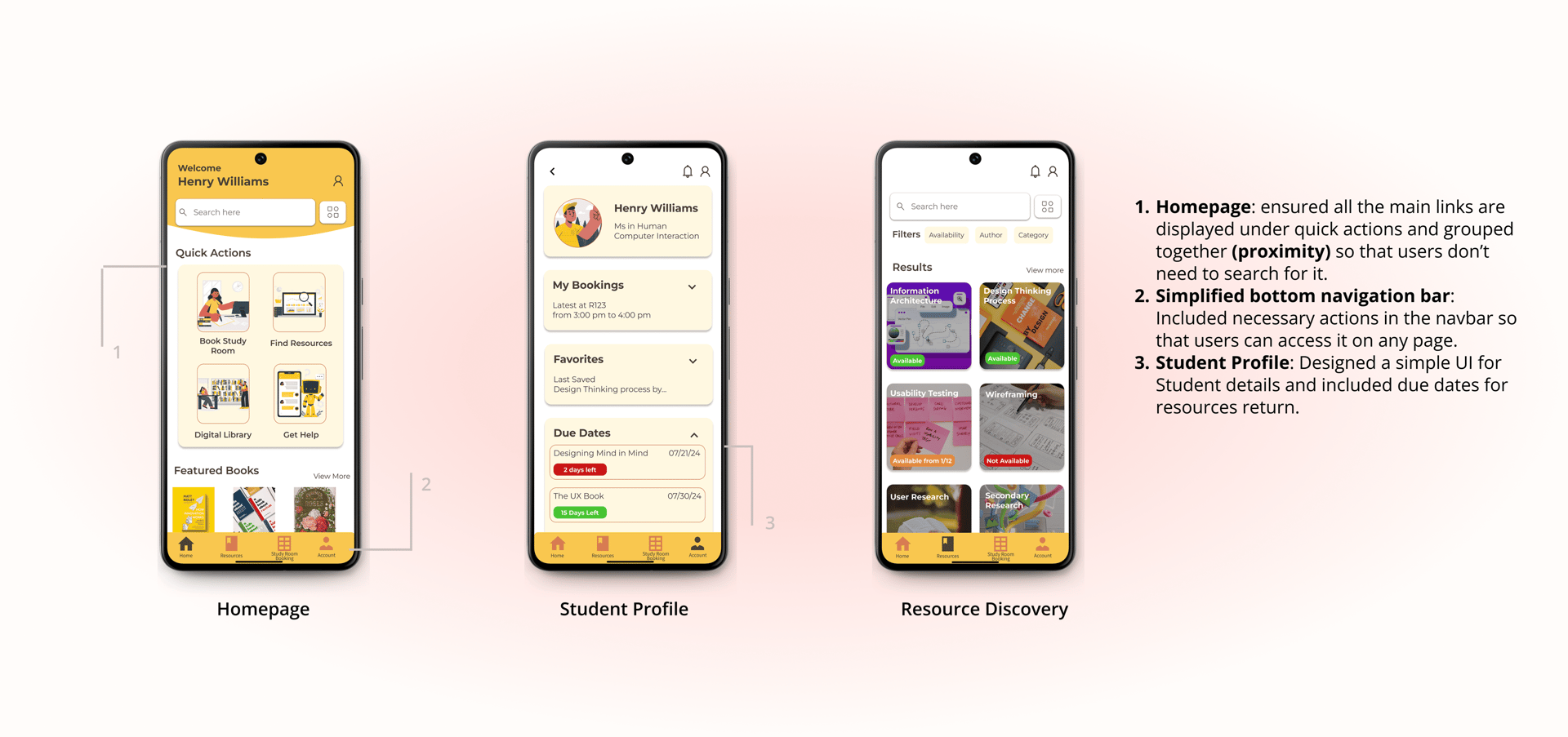
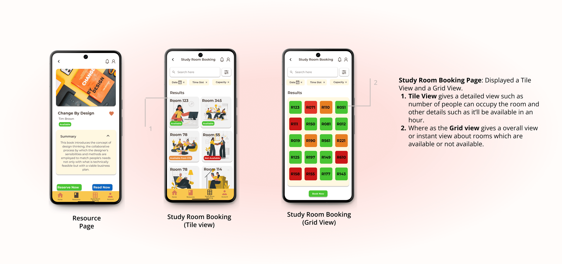
Final Design Solution
Retrospective
What I learned from the Whole Process?
User research shaped key features: Real-time availability and a toggle view weren’t in the initial concept but became essential through feedback.
Simplicity is key: Removing unnecessary filters improved the overall experience.
Importance of Iterative design: User feedback helps in iterative design. We may not be able to notice few pain point but users catch it easily.
Read more of my case studies

PMPML App Case Study
Get in touch👋 - sayali.ippalpalli@gmail.com

